Point of Sale Display
The second assignment has taken me a lot longer then i would have thought, the reason for this is because is firstly i realized i really need to read the assignment criteria thoroughly and probably more then once, it might also help if i used some sort of underline!
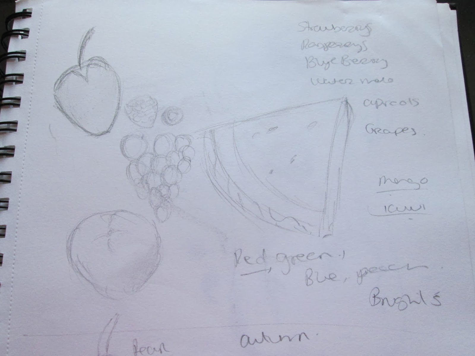
The first thing i really did was start research on summer and autumn fruits and veg, i used these as drawing templates then produced pencils sketches on different combination making notes about colours for each.
I then branched off into some exploration. (this is where reading the assignment would have come in handy)
My first concept was something of fun i wanted to really experiment with the feeling of the season showing fruits and what identify with that season.
I painted out my first concept in watercolor, then redrew it in pencil as it gave a more detailed experience.
Personally i prefer the versions with the two girls i think it shows fun and the seasons. however when i reread the brief it pointedly used the word Quality, now this put me more in mind of a Marks and Spencers campaign of quality and elegance, and although the fruit (i think) are render with quality in mind the over all theme is more of fun and joviality.
so i went back to the drawing board ! literally. I reread the brief and decided to do another set of observation drawings. i drew a set of fruit for summer then autumn using Derwent inktense pencils(love them)
i used these because i am a messy artist and so precision is difficult to me normal water colours i uses splodge or blur or muddy(im working on improving them) however as inktense only activate once it prevents this issue and because its a pencil give me greater precision.
both drawings i liked. however i put them to the side for a couple of days and worked on a softer rendering in pastels.
The pastels i liked but again i feel like it more represented the dream of the season as they where slightly fuzzy.
I reread the brief again and saw that the final piece was 12 x12 , which is where i broke out photoshop and my trusty wacom 21ux (my precious). I cleaned up the images and pulled them into the right size canvas tinted the colours and pulled in fonts i think are applicable to the relevant seasons.
I have tried to retain the appearance of the watercolour paper under it as i think it gives it a more traditional look.


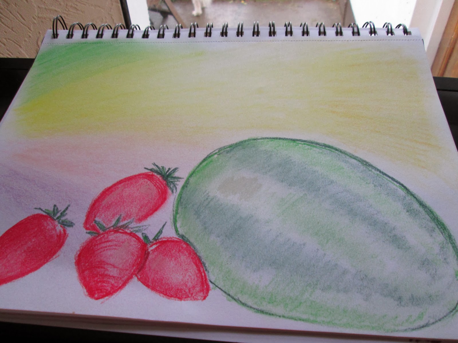

i chose summer palate of bright colours and a sunny background. i used pencils both derwent coloursoft pencils and prismacolour. i used strawberry's and melon as contracting colour of bright reds and spring greens.

Autumn - i used earthy tones and again pencils for more detail i used colours like autumn trees and a background. i used pumpkins and apples, i also used autumn leaves. i wanted to convey a blustery background.

Objective summer fruits - i decided to do these with a water based colour, I used derwent Inktense pencils this gives a brighter colour more luminous, i think it reflects a quality to the fruit.


Exploratory sketches , sketching and listing different fruits


Mood Board Summer and Autumn
The below mood board helped me select colours and themes for my assignment. i wanted to portray bright colours and fun, as well and the quality of the product.

No comments:
Post a Comment