For the exercise requiring to test different materials and paper i decided to draw cherrys.
lucky for me i have referenced a few books to help me along.
The first thing i was suprised regarding was oil painting, up until this exercise i have avoided using oil paints, for reason of practicalitys and also i personally associate oil painters with more classical types of art work. i was suprised to find i really loved working with it. allthough i only painted a pair of cherrys so far!
list of materials used
derwent pastel pencils
derwent charcol pencils
derwent inktense pencils
faber and castell oil pastels
windsor & newtons designer gouche
windsor & newtons water colours
Promarker markers
daler rowney oil paints
decoart acrylic paints
caran d'arch neocolor 1 crayons
Cherrys on watercolour paper.
Cherry on water colour paper. reflections
Pastel pencil cherry - I think this worked well it gave more of a textured effect almost spotted, this is probably due to the tooth picking up more material in the dips. i did not smudge this, well unless i hit it accidentally!
Cherry charcol - this gives a more basic image rougher then the others this might have been due to my tecnique used it was harder to control and so produced a less acurate image however saying that it still looks like a cherry ! its also good for producing a range in tonal values
Gouache cherry - i love the luminosity of this cherry it gave a smooth and bright rendering making it look shiner and less textured then the others.
Neocolour crayons - again a more textured approach with less control, its more an idea of a cherry.
Oil Pastel cherry - usually i have issues with oil pastels but in this exercises i expermented with a less pracise rendering of said cherry. i actually really liked the outcome. its not very defined but i like the colour from light to dark that it produced. again added texture not as much as the crayon and pastel but enough to make the skin look luminous and textured.
coloursoft pencils cherry - usually i love pencils for this type of the thing the rendering is more accurate then some of the more lose depictions but im not sure im happy with it on this paper. it does look like a mixture of colours which is nice as i built different colours up maybe its my rendering of this and not the material!
Artbar crayons - these are water soluble crayons that are triangular, i think they are designed to lay down alot of colour fast. so probably not a good idea for detailed work however using the pointed edge of the triangle did provide a level of detail. i did find that the medium crumbled on this paper making it harder to produce reconsnisable results.
Art pen - these are the PITT pens by faber and castell, i ususally use them for drawing manga or putting notes on things(which i probably shouldnt!) i didnt like this rendering though partially this was because i dont have many of these pens and so the colours are more orange then id like. i attempted a more crosshatched effect which i think looks ok. the pens were not happy to be on a more textured surface though
Acrylic cherry - i liked working with acrylic the only time ive used it before was to paint decals on models. i think it would be better applied onto a flatter tooth paper as the bumps in the paper made it difficult to render lines nicely it didnt come out as lumanoius as the gouache but i do like this version. in eye light it has a very slight shine to it.
Inktense pencils - another derwent creation, i have always loved these pencils you can build up colour layer by layer and they do not mix. which is nice gives a nice watercolour affect and softens the look, but because it is a ink has more of an intense colour then traditional watercolour.
Aquatone pencils - these are a crayon that is water soulable round like a normal crayon. ive never really been a fan of these since i bought them, having said that the cherry looks ok. the rendering is a little bit muted and messy.
graphic tint - again derwent creation water soluble graphite, i like the look of these deep colour an amount of precision produces a darker rendering the most of the others.
Water Colour pencils - somewhat similar to the ink tense rendering yet even more softer good colour and was easy to apply, used pencils to draw then brush to wet. after this i added detail with the pencil to the wet paper.
Water colour - using pans i created this applying a base washing then building it up. again less precise then pencils, though this might be due to my lack of experiance with a brush! again a softer image, easy to blend and looking at it now i wished id made the outline less thick and more blended!
Oil Cherrys!
Oil cherry - well first time using oil paint , i actually love this rendering i dont think the photo does it real justace. im not sure how long its meant to dry though someone told me three months so ive stuck some sugar paper over it so it wont smudge more .. love the colours and was fun to render. was not easy to get precision but strong colours. i only have six colours and only really used blue and red. i dont really know any techniques for oils so thats my next book to buy. i think the edge of the left cherry on the left of said cherry needs blending a bit better. but over all looks like cherrys to me! i was expecting a splodge...i will be experimenting with this further.
Cherrys on watercolour paper, done with a sponge and watercolour tubes of paint. ok so i thought id give it a go with a sponge alot of fun though i think i ended up with a significant amount of paint on myself. I used a base red and smoothed the paint on with strokes to get an overall hopefully coherent shape (we will ignore the right hand side of the cherry that seems to have got fuzzed a bit) then i used mauve and red to dab texture on to the cherry . i then built up mauve alone. last i added black mixed with mauve to achieve the shadow at the bottom and top sides. I did like how this turned out i think if i was to revisit this exercise i would use masking fluid for the outside to give a more crisper edge as well as for the highlights. its quite textured but again not very precise.
Flat tooth paper - smooth
sugar paper
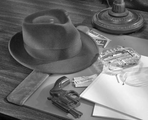
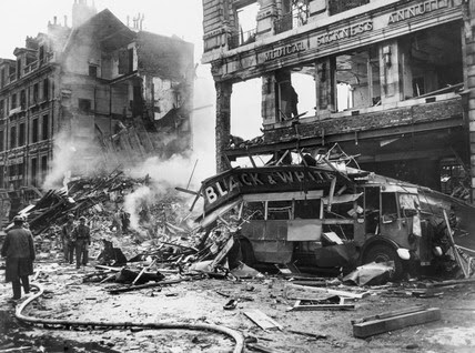
 when i first read the passage from the book, what struck me the most is that the man seemed to be very angry, angry about the murders angry at the girls for being victims, angry at the city.
 i decided to use charcoal for this i wanted a real contrasting look at London blitz as well as adding in the detective air to it.


