- A Tree
- A child running or walking
- a building
Photocopy them in black and white at different scales and sizes so that you have several versions of each image.
working with a square format, arrange some of the cut outs to create a representational image. you may use the distortion of scale of scale of one element compared to another to create an image which is interesting visually. it is not important that the image is real as a photograph would be. move the fragments sot they are not always vertical or horizontal to the frame.
you may need to add a drawn line to suggest a horizon, to separate the ground from the sky and to create an illustration of space or distance.
experiment with the positions of the horizon relative to the visual fragments.
scan and print or photocopy these designs or do a quick trace of each design so that you can compare the visual impact of one with another.
Then in your learning log make notes in answer to these questions:
- how does your sense of the image and its meaning change when the figure is smaller than the other elements? The smaller the image in relation to the one at the front usually gives an idea of depth. it also depends on over lap if a smaller object is in front of a big object and it on the same line it means that the item is physically smaller and not just in the distance.
- if the elements are at differing angels to each other and at an angle to the frame, what dynamic is suggested? when i put elements at funny angles i think it made the image more believable and less rigid.
- if all the elements are completely horizontal and vertical in relation to the frame what dynamic is suggested? what is your opinion about this image and what sensation does it communicate.? this actually confused me at first, i changed the child so he is now horizontal while the other two pictures are vertical and in line with the borders, this gives the dynamic of falling, and again depth.
- what is your favorite composition? explain why you feel it is most successful.


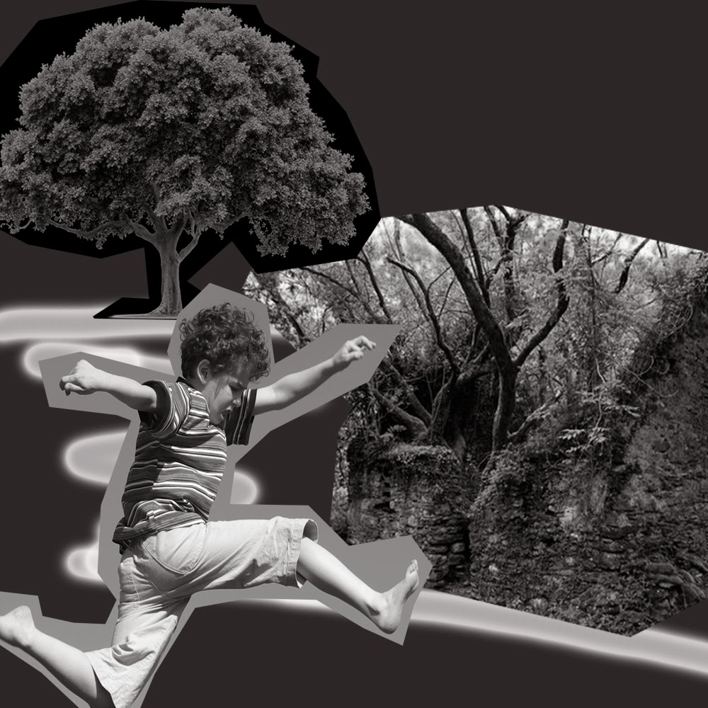
 this one to me represents the child running to the house
The one above i think is my favorite i think it has more "energy" the child and the tree give us a focus and hem us into the compistion while the house gives us depth.

This one i did at funny angels along the horizon lines, the child looks like his running down the path.

No comments:
Post a Comment