Tuesday, 12 May 2015

Exercise : Text and Image


Typography has always been a bit of a weakness of mine, I dont usually think about it till after ive finished a painting or even really consider it at all, im not sure if its anything i will ever develop a real interest over but well you never know!

having said that though i did enjoy this to some extent, i painted the words in gouache. 


Saturday, 9 May 2015

Travel guides


This task has literally taken me ages to do, I started originally with the concept of doing a quite graphic design of the city of instanbul finished it then realised it was way to ridged, so I thought I'd redo it in watercolours. I think it turned out rather well considering .  I've really weak at perspective and buildings so it was a challenge! 


Monday, 2 March 2015

Exercise: Editorial Illustration

Loves me , Loves me not

I picked loves me loves me not for the editorial illustration, i found this exercise really difficult because i essentially don't really understand what is required for an editorial illustration. i looked at alot of magazines and on-line and i didn't seem to find much of a common threat. some where portraits, characters, decorative. i did see that there was alot of graphic type with magazines so after a first scrapped attempt i went with that. 


Exercise: Your own work


Originally i created this for the editorial love me love me not , but thought it was to cute. i think it would be great as either decorative or maybe on a bag/button or tshirt. alot of my illustrations are good as decorative i think.


the below i think would be good as a magic card or maybe in a magazine like imagine fx, my tutor also suggested it could be niche for museums, maybe in a couple of years when my skill has improved.  I do enjoy mythology for ancient cultures.


Thursday, 8 January 2015

Magazine illustration - lost

I started this by illustrating a 1940s field compass that was my partners grandfarthers.   I worked exstensivly on the final piece and it is by far the more detailed version of my work. the theme lost is on two levels, first the lost in a strange land with the sea as the compass and the second as a lost battle (becuase the poor black ship is so going down vs three other ships  then again maybe it will execute a swift getteway!).

Sketch of still life : I think i could have done a better job at this the perspective is off but i guess it lends a bit of charactor to it even though its not "correct". done with sketching watercolour pencils.


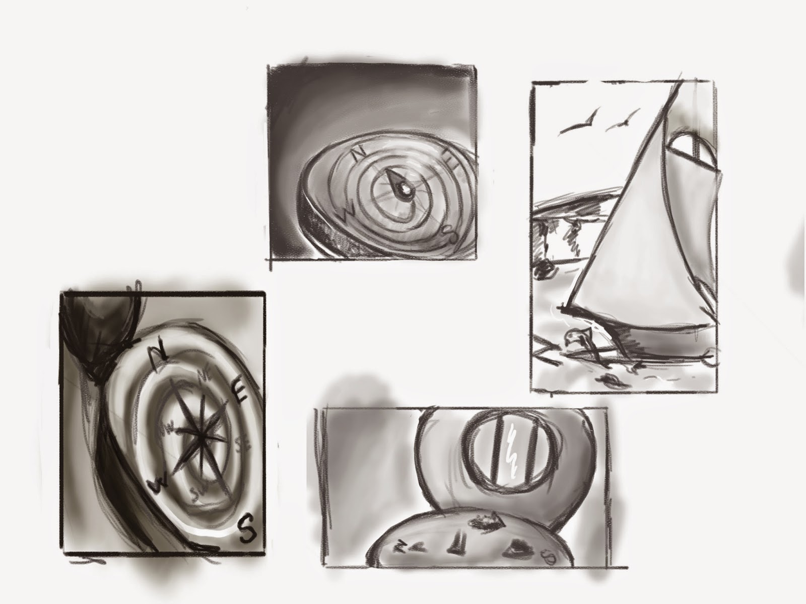
Thumbnails: as soon as i saw the compass i knew i wanted to use it for the lost articale. my first impulse was to do something simple using a compass that was confused and swirling out of control.  however i guess my imagination got the better of me and i decided to go with the compass world instead.


Orignal Tonal - at this point i swapped to digital i still havent got gt full compistion but im have a roughed out idea of where everything is.


Final piece :  i really enjoyed creating the below piece and i worked on it solidly having said that i am not happy with a few things about it.  first tritons anatomy is off, for some reason i have problems with shoulders specifically im actually taking a mentorship soon so i am hoping to improve my art skills in this area. 


Character development

Charactor development again i didnt do so brilliant with this i dont think, im to worrid about techically rendering the charactor to even think about the actuall charactor. 

Thursday, 2 October 2014

visual distortion

Visual distortion i found this exercise difficult and i tried my best with it, im not really a fan of patterns and have yet to really properlly explore textures in depth. i think think that the picture didnt turn out well, it lost some of the "cuteness" maybe in the eyes.