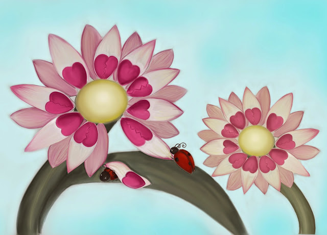
Originally i created this for the editorial love me love me not , but thought it was to cute. i think it would be great as either decorative or maybe on a bag/button or tshirt. alot of my illustrations are good as decorative i think.
Monday, 2 March 2015
Exercise: Your own work
Originally i created this for the editorial love me love me not , but thought it was to cute. i think it would be great as either decorative or maybe on a bag/button or tshirt. alot of my illustrations are good as decorative i think.
Thursday, 8 January 2015
Magazine illustration - lost
I started this by illustrating a 1940s field compass that was my partners grandfarthers. I worked exstensivly on the final piece and it is by far the more detailed version of my work. the theme lost is on two levels, first the lost in a strange land with the sea as the compass and the second as a lost battle (becuase the poor black ship is so going down vs three other ships then again maybe it will execute a swift getteway!).
Sketch of still life : I think i could have done a better job at this the perspective is off but i guess it lends a bit of charactor to it even though its not "correct". done with sketching watercolour pencils.
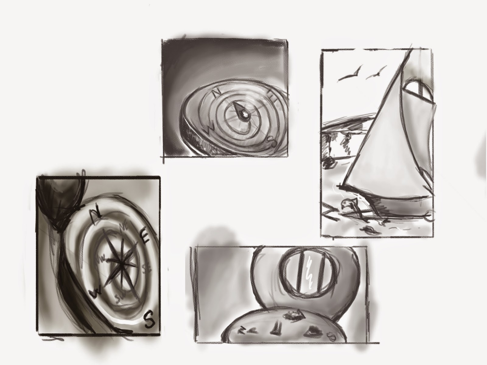
Thumbnails: as soon as i saw the compass i knew i wanted to use it for the lost articale. my first impulse was to do something simple using a compass that was confused and swirling out of control. however i guess my imagination got the better of me and i decided to go with the compass world instead.
Orignal Tonal - at this point i swapped to digital i still havent got gt full compistion but im have a roughed out idea of where everything is.
Character development
Charactor development again i didnt do so brilliant with this i dont think, im to worrid about techically rendering the charactor to even think about the actuall charactor.
Thursday, 2 October 2014
visual distortion
Visual distortion i found this exercise difficult and i tried my best with it, im not really a fan of patterns and have yet to really properlly explore textures in depth. i think think that the picture didnt turn out well, it lost some of the "cuteness" maybe in the eyes.
a tattoo
tattoing is a anicient art and has been found all the way back to 3200 bce on the otzi mummy.
the practice has risen in popularity making it fashinable to have a tattoo or two, it is seen as a way of indiviulism and self expression.
They can range in style.
Japanse influenced tattoos
Celtic influance tattoos
polynesian tribal tattoos
filipino tribal tattoos
India /hindu

so i decided to kill two birds with one stone and design the above. my mother always used to help us make lavender bags to sell to the neighbours as children. she was also born in febuary and there is a corrrelation between her birth stone of amythyst and the colour used for the lavender flowers. i included flourish to make it more feminine.
it is a simple design and i like it alot.
a menu card
i found this exercise a little on the unintersting side, probably because i dislike fish! i did various research into fish and what other resturants would use drawing out plates and fish upon the plates. in the end i choose the square format to compiment the more rounded shapes of the fish.
i choose a contrasting purple and a golden yellow orange for the fish, i hope to make it appertising.
a childrens book cover
a childrens book cover
i appoached this assignment with enthusiasm, i started by sketching various animals from the world, then refining the characters to a more stylised approach. when i had decided upon a style i rendered other animals in the same style.
The characters where rendered in thee or four colours making a striking composition, i tried to pick colours with a distinctive contrast to make them stand out.
i then set to work on the covers i wanted allot of bright primary colours, the first design i chose a block approach separating three chosen animals. the animal panels are in there environment. this is my personal favourite.
the second cover i tried to include more of an around the world approach, in a more litral way. i think this however while converying animals around the world lacks the punch of the first one. i think aswell that the text is in the weomg place and is not as clearly shown, this is a fault with bad planning on my part.
the last one has more of an emphases ln the text and title then the other. perhaps i should have included more animals in the middle. i am also not happy with the contrast of the world word.
Subscribe to:
Posts (Atom)


