Sunday, 26 January 2014

Reading an image


Look carefully at this image


  • What is the image about. what is it saying? the image is of scene in a cave the image flows thought the colours
  • Work out the narrative and identify the story? The image is a narrative about children searching a cave and finding a dragon, they where probably looking for the treasure.
  • Describe the palette and tonal range which has been used.  Note if the colours are hot or cold, whether the elements are detailed or textural, and where these approaches are used. the main focus parts are done with very hot colours from the colour of the children torch to the dragon in less intensity. it guides the eye from the torch reflecting on the wall to the dragon. texture the background of the cave is very rough and textured, the texture of the dragon and children is smoother. the back ground is contrasted from a light cyan blue to a violet.
  • is there any connection between hot colour and the importance of the element in telling the story. Red traditional denotes either passion or danger, purple royalty and luxury, this is however cultural interpretation based on western values. i think in this case it is important not only in telling the story but also in assigning meaning. it also helps to set heirachy in the picture, our eye follows the warmer colours, I read somewhere that this is because as a human we naturally follow hotter colours to assess danger first. i cant remember where i read it i will dig this out. could have been the lynda.com tutorial on colour theory.
Begin to identify the hierarchy with in the image.  Which are the most important elements in terms of carrying the narrative or conveying the ideas and how have these been treated? the most important image is probably the dragon, not only is it the hottist part of the image its also the lagist with the most contrast. secondary the flame of yellow draws the eye to the children with a complmentary colour of green .


more butterflys

I guess this is my week for drawing butterfly's!

I think this is really my first attempt at a more detailed drawing and plus more of a composistion. I messed up the right wing as the black detail is to think and once id done it as it was black i couldn't fix it :(
the only other thing id change is that the flower in the background  it tilt right instead of left as at the moment its pointing of the page and id rather it read round the page. I was also contemplating a back ground colour but since i was limiting to a palette of purples and yellow i wasn't really sure what colour would work without ruining it. I also think that the lighting is a bit all over the place ... oh well.
however having said all that i a really proud of it, i think that its shows that my technical skills at drawing are improving and although this is not a drawing course, i think drawing is important technical skill. especially since i want to do children book illustration.


Butterfly done with inktense. i was proud of the detail on this it is done on A4 with inktense and then water applied. i did however smudge it on one side :(


Friday, 17 January 2014

Wednesday, 15 January 2014

Illustrating Visual Space

Using internet searches or your own visual references select an image of each of the following:


  • A Tree
  • A child running or walking
  • a building
Photocopy them in black and white at different scales and sizes so that you have several versions of each image.


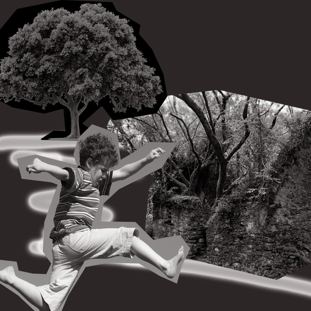
working with a square format, arrange some of the cut outs to create a representational image. you may use the distortion of scale of scale of one element compared to another to create an image which is interesting visually. it is not important that the image is real as a photograph would be. move the fragments sot they are not always vertical or horizontal to the frame.

you may need to add a drawn line to suggest a horizon, to separate the ground from the sky and to create an illustration of space or distance.
experiment with the positions of the horizon relative to the visual fragments.

scan and print or photocopy these designs or do a quick trace of each design so that you can compare the visual impact of one with another.
Then in your learning log make notes in answer to these questions:


  • how does your sense of the image and its meaning change when the figure is smaller than the other elements? The smaller the image in relation to the one at the front usually gives an idea of depth. it also depends on over lap if a smaller object is in front of a big object and it on the same line it means that the item is physically smaller and not just in the distance.
  • if the elements are at differing angels to each other and at an angle to the frame, what dynamic is suggested? when i put elements at funny angles i think it made the image more believable and less rigid.
  • if all the elements are completely horizontal and vertical in relation to the frame what dynamic is suggested? what is your opinion about this image and what sensation does it communicate.? this actually confused me at first, i changed the child so he is now horizontal while the other two pictures are vertical and in line with the borders, this gives the dynamic of falling, and again depth.
  • what is your favorite composition? explain why you feel it is most successful.


 this version was the first that i did its pretty good in terms of scale, its not very "dynamic"
 This one i dont really like as much i think its the tree size that bothers me, the child and the house look good though.

 this one to me represents the child running to the house     


The one above i think is my favorite  i think it has more "energy" the child and the tree give us a focus and hem us into the compistion while the house gives us depth.


This one i did at funny angels along the horizon lines, the child looks like his running down the path.


Monday, 13 January 2014

Pastals on watercolour paper


Pastels!
I have to say this was so much fun, i really enjoyed doing this i can really see how with a lot of practice you could create a really nice illustration. but i did come across some issues mostly with smudging where my hand had been. i dont know if this is because im generally a sloppy artist or i am missing  a trick some where (probably both) ok so what i liked about this, i like the gradient purple mixed twilight look, i also like the shoulders part of my dog.  i did find it difficult after smudging the tail massively to get it back to a good rendition. maybe something i can work on. I will try to clean it up tommorow as i am feeling a bit of blurred eyed


Sunday, 12 January 2014

Lynne Chapman

While doing some research about potential future courses and the path i wish to pursue, which current consists of illustration, creative writing and either book design or drawing 1.
I stumbled upon videos resources for the OCA on vimeo.

once there i came across some interviews of Lynne Chapman, and i was inspired by her work. it is exactly the type of area i would love to Illustrate.

http://www.lynnechapman.co.uk/index.php


http://vimeo.com/15019897


Lynne Chapman uses pastels on a textured paper base, but although this textured approach is pretty spectacular , and i intend to give it ago at some point, its not that which interests me. it is the characterizations colour and detail that i have decided i wish to aspire to.

It's My Turn - Big Jar

I have looked over my previous worked and concluded that my detail really needs work.  perhaps this is because to give my self a little bit of a break little over a year ago i had not really drawn anything except doodles since school. i did not take art at gcse so my artistic experience is pretty limited.
I am really enjoying this course though and I aim to be putting more energy and time into it in the future!


Tuesday, 7 January 2014

Craig Smallish - Illustrator

While trawling through the many lynda.com videos that i use for technical training for work. i have been adding in a more creative type of video.  I came across a video about illustration by Craig Smallish.
The video is about his experiences as an illustrator, tips on how to get into the career and his opinions regarding illustration.  

http://www.lynda.com/Design-Drawing-tutorials/Insights-Illustration/141796-2.html

I love the bright colours of his art!


Thursday, 2 January 2014

Point of Sale Display - assignment 2

Point of Sale Display

The second assignment has taken me a lot longer then i would have thought, the reason for this is because is firstly i realized i really need to read the assignment criteria thoroughly and probably more then once, it might also help if i used some sort of underline! 
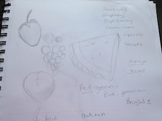
The first thing i really did was start research on summer and autumn fruits and veg, i used these as drawing templates then produced pencils sketches on different combination making notes about colours for each. 
I then branched off into some exploration. (this is where reading the assignment would have come in handy)
My first concept was something of fun i wanted to really experiment with the feeling of the season showing fruits and what identify with that season. 
I painted out my first concept in watercolor, then redrew it in pencil as it gave a more detailed experience.
Personally i prefer the versions with the two girls i think it shows fun and the seasons. however when i reread the brief it pointedly used the word Quality, now this put me more in mind of a Marks and Spencers campaign of quality and elegance, and although the fruit (i think) are render with quality in mind the over all theme is more of fun and joviality.  
so i went back to the drawing board ! literally. I reread the brief and decided to do another set of observation drawings. i drew a set of fruit for summer then autumn using Derwent inktense pencils(love them)
i used these because i am a messy artist and so precision is difficult to me normal water colours i uses splodge or blur or muddy(im working on improving them) however as inktense only activate once it prevents this issue and because its a pencil give me greater precision.
both drawings i liked. however i put them to the side for a couple of days and worked on a softer rendering in pastels. 
The pastels i liked but again i feel like it more represented the dream of the season as they where slightly fuzzy.
I reread the brief again and saw that the final piece was 12 x12 , which is where i broke out photoshop and my trusty wacom 21ux (my precious).  I cleaned up the images and pulled them into the right size canvas tinted the colours and pulled in fonts i think are applicable to the relevant seasons. 
I have tried to retain the appearance of the watercolour paper under it as i think it gives it a more traditional look. 


i chose summer palate of  bright colours and a sunny background. i used pencils both derwent coloursoft pencils and prismacolour.  i used strawberry's and melon as contracting colour of bright reds and spring greens.


Autumn - i used earthy tones and again pencils for more detail i used colours like autumn trees and a background. i used pumpkins and apples, i also used autumn leaves. i wanted to convey a blustery background.


Objective summer fruits - i decided to do these with a water based colour, I used derwent Inktense pencils this gives a brighter colour more luminous, i think it reflects a quality to the fruit.

Objective autumn fruits again using ink tense but in more muted autumn tones a more earthy palette.


Exploratory sketches , sketching and listing different fruits 


Mood Board Summer and Autumn
The below mood board helped me select colours and themes for my assignment. i wanted to portray bright colours and fun, as well and the quality of the product.