Friday, 10 July 2015

Assignment 5 - a Week of fairys


A week of fairy's. 

when i first started this assignment i knew i wanted to push my skills a little, and i wanted it to be colourful.

i came across some sketches id done of a fairy and decided i wanted to do a fairy a day, from there i toyed with ideas of fairy flower theme and then insects and decided on a combination. 

To make each fairy distinct i decided to make each a different ethnic descent and a different colour costume. I have not painted a lot of different skin tones and so it was a challenge . 

If i had more time id have worked a little more on anatomy and maybe i am not 100% happy with the bluebells on Monday, but overall i am happy with the results. 


Thursday, 25 June 2015

Exercise : Working for children


I had a bit of an issue with the age categorisation for children, not having children or knowing any children i just had to go from my own ideas and from various articals

http://writeforkids.org/2014/02/understanding-childrens-book-genres/

http://www.scholastic.com/parents/resources/article/parent-child/about-our-age-groups

I think the consensus is for younger children the books are bright with high contrast and possibly tactile. the pictures seem to get more complicated and somewhat more realistic for older readers.


I think there also some cross over for example where spot i would consider showing to a baby as well as a pre school child.

I dont think that the age ranges are as appropriate just more of a guide line children learn at different rates and have different tastes, they are after all mini people.  with the likes of some books harry potter or the dark materials series they cross over into adult genre as well.  for example with the harry potter series there was an adult cover and a children's set of covers (I bought the children's because they where much more appealing to me!) when is started brain storming i initially thought of an elephant and festival and then researched Ganesh and the festival where elephants parade the street.

i would be tempted to repaint it digitally as it didnt come out as well as i though with watercolours, gauche and ink.  however i do like the overall design and the colours they are bright but not massively in your face bright so i hoped they would appeal to a wide range.


Wednesday, 24 June 2015

exercise packaging


Exercise packaging 

for this exercise I decided to research recently extinct animals, mostly because I read about the Tasmanian wolf being hunted to extinction and then the last one dying in a zoo due to neglect, it starved to death.   I started by sketching the Tasmanian wolf (which is in fact a marsupial) and then painting the front covers, i thought the back of the box could have  a realistic drawing with the educational facts of the animals. 


Tuesday, 12 May 2015

Exercise : Text and Image


Typography has always been a bit of a weakness of mine, I dont usually think about it till after ive finished a painting or even really consider it at all, im not sure if its anything i will ever develop a real interest over but well you never know!

having said that though i did enjoy this to some extent, i painted the words in gouache. 


Saturday, 9 May 2015

Travel guides


This task has literally taken me ages to do, I started originally with the concept of doing a quite graphic design of the city of instanbul finished it then realised it was way to ridged, so I thought I'd redo it in watercolours. I think it turned out rather well considering .  I've really weak at perspective and buildings so it was a challenge! 


Monday, 2 March 2015

Exercise: Editorial Illustration

Loves me , Loves me not

I picked loves me loves me not for the editorial illustration, i found this exercise really difficult because i essentially don't really understand what is required for an editorial illustration. i looked at alot of magazines and on-line and i didn't seem to find much of a common threat. some where portraits, characters, decorative. i did see that there was alot of graphic type with magazines so after a first scrapped attempt i went with that. 


Exercise: Your own work


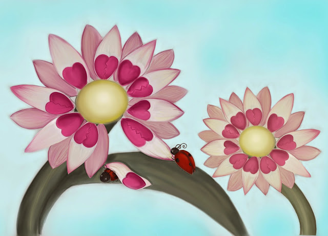
Originally i created this for the editorial love me love me not , but thought it was to cute. i think it would be great as either decorative or maybe on a bag/button or tshirt. alot of my illustrations are good as decorative i think.


the below i think would be good as a magic card or maybe in a magazine like imagine fx, my tutor also suggested it could be niche for museums, maybe in a couple of years when my skill has improved.  I do enjoy mythology for ancient cultures.